OneSignal is the largest push notification and marketing automation service, sending 8+ billion daily notifications on 1+ billion devices for 1.2mm+ developers.
Key Activities
I joined as the 6th person at OneSignal, and during my time I was the sole PM and designer responsible for the product experience. Key activities included:
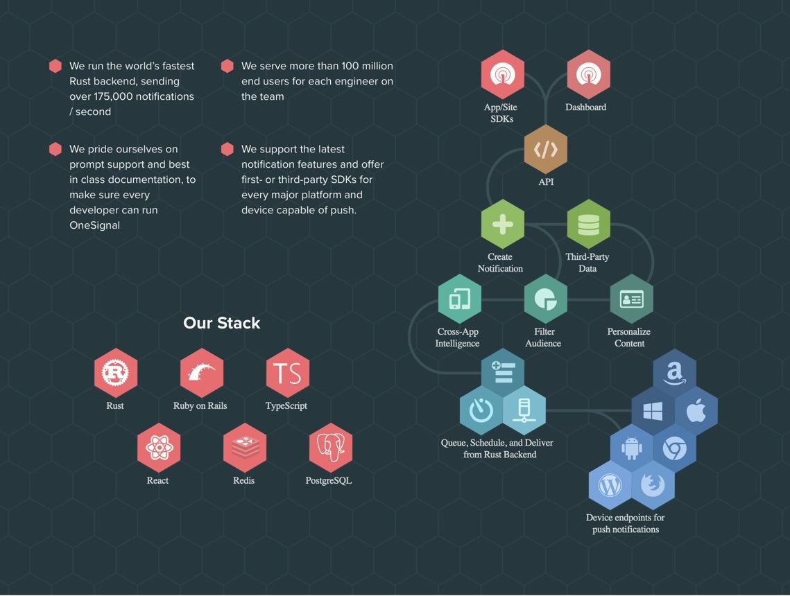
- Redesign of core OneSignal Dashboard including design system, custom form elements, and information architecture
- Design & launch of self-service Web Push flow, part of our web push product in use on ~3% of top 100k internet sites
- Design & launch of email support and audience segmenting tool
- Rewrite & rearchitecting of OneSignal documentation
- Redesign of OneSignal website
- Conducting user research (data analysis & convos) and writing case studies
- Management activities (market analysis, Series A deck/pitch, financial models, refined customer support flows, etc)
Dashboard Redesign
OneSignal's original dashboard was showing it's age and had many UX and clarity issues, and it wasn't the right design for the many features we planned to build. I went about a redesign with three themes in mind that represented our overall problem diagnosis and product goals:
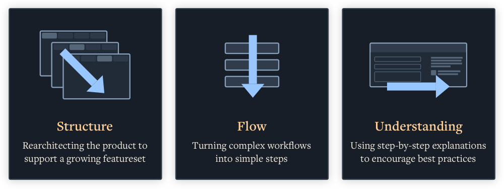
Focusing on these themes resulted in adding or improving the following:
- New step-by-step UX simplified usage
- Advanced features hidden to not overwhelm more frequent use cases
- Standardized & clarified form elements
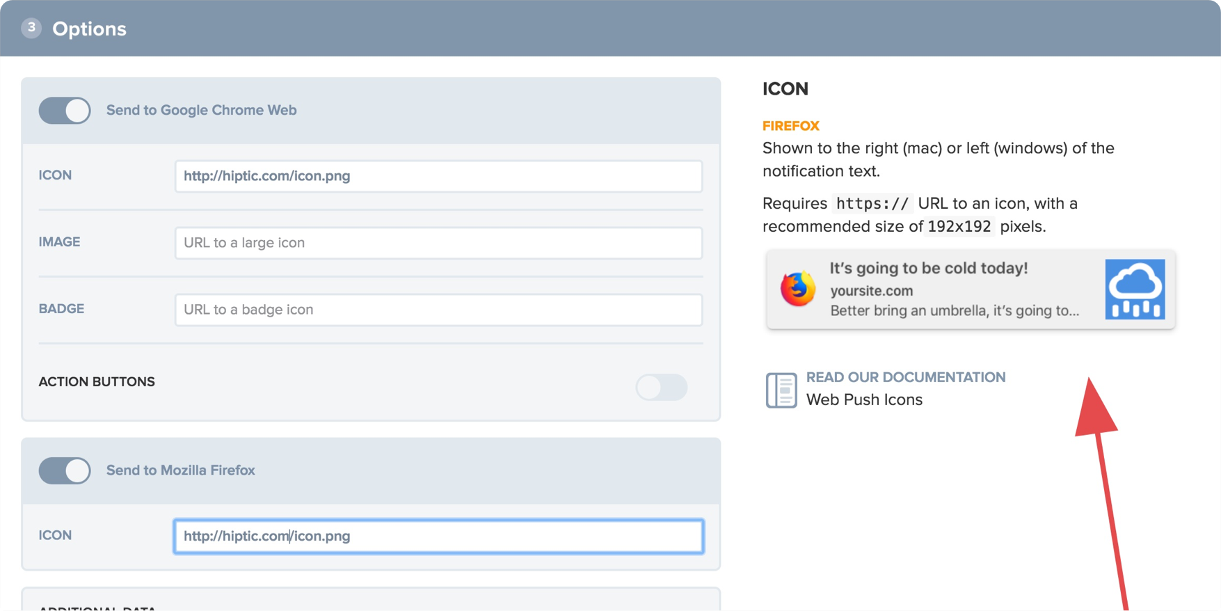
- Added tips to provide contextual info on features and direct links to docs
- Substantially improved message previews to give users better sense for presentation of their content
- Refactored information architecture to scale to new & future features
- New coat of paint to suggest premium product
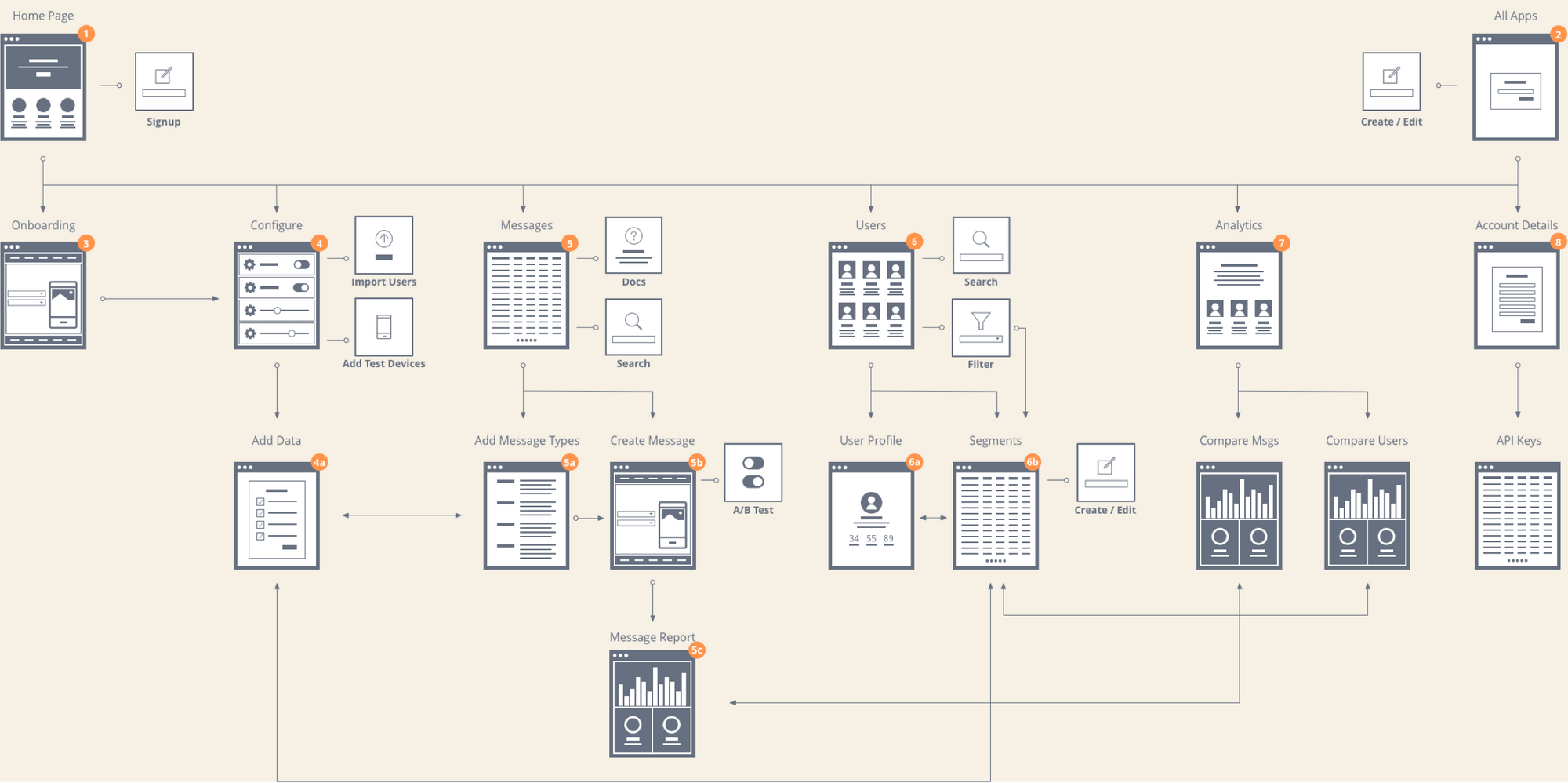
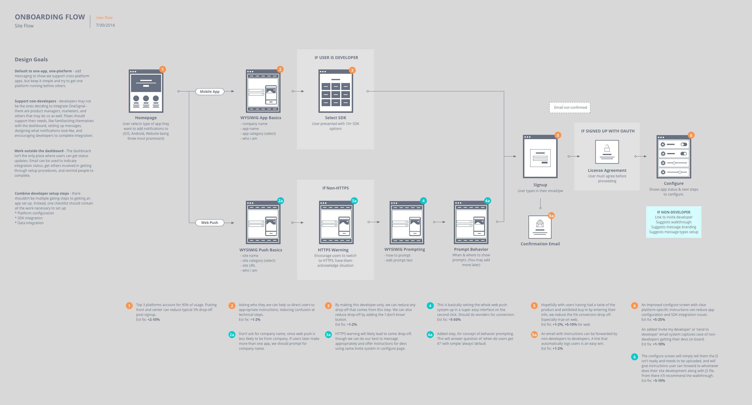
I tackled this problem by planning forward a few versions to features we wanted to build, organizing current and planned features into similar clusters, finding opportunities to simplify workflows by taking an opinionated approach, and identifying shared actions and desire paths. I built out the information architecture before jumping into visual design. You can read more about the process I used in my IA post When to Add Hierarchy, and about the redesign in the announcement post OneSignal has a fresh new UI.
After a few iterations, the solution I settled on included the following changes:
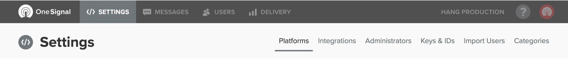
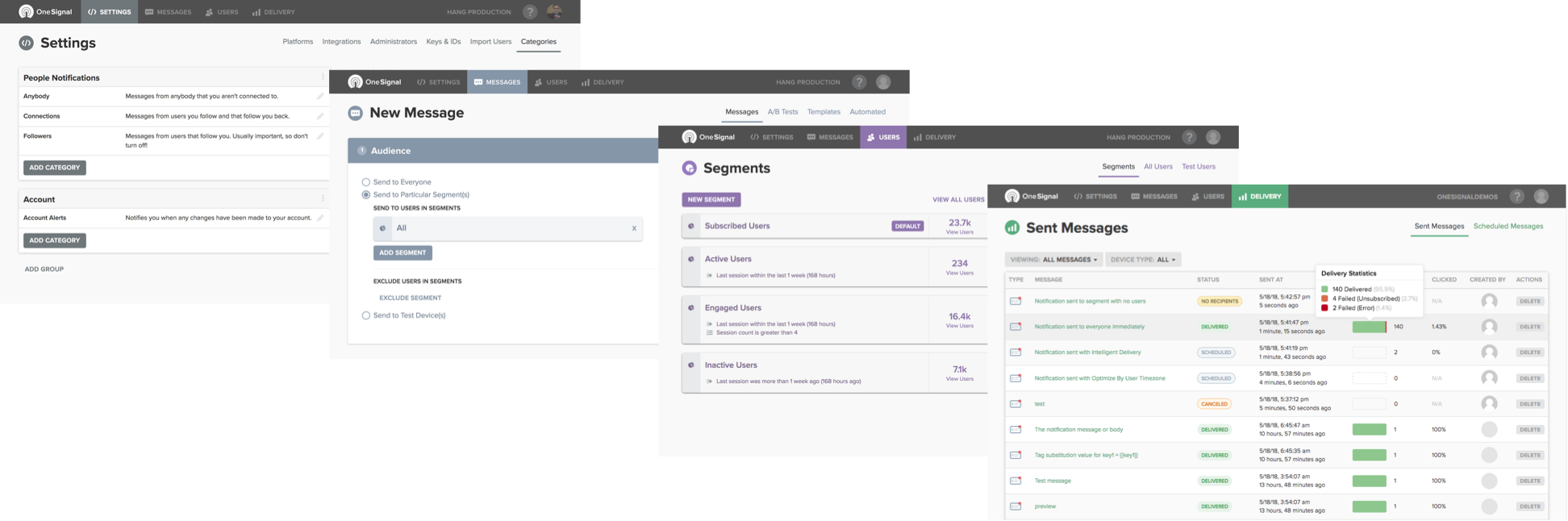
Two-level hierarchy - Features were reorganized into four major sections - Settings, Messages, Users, Delivery. Within those, the most common page was presented first, and power user features were available one level down. This better reflected how users used and got value out of OneSignal, especially within teams. Settings was primarily targeted at developers, marketers used Messages, different marketers often liked to build targeted audiences in Users, and for those that didn’t just fire-and-forget their messages Delivery helped them see their performance.
Color-coded sections - Enterprise tools, especially form-heavy tools that reuse the same elements over and over again, tend to have a lot of visual same-ness across pages. Without any significant landmarks to ground them, some users will inevitably get lost. By giving each section a unique color and icon through a custom theming engine, and reinforcing those throughout our documentation, users were less likely to wind up in the wrong place.
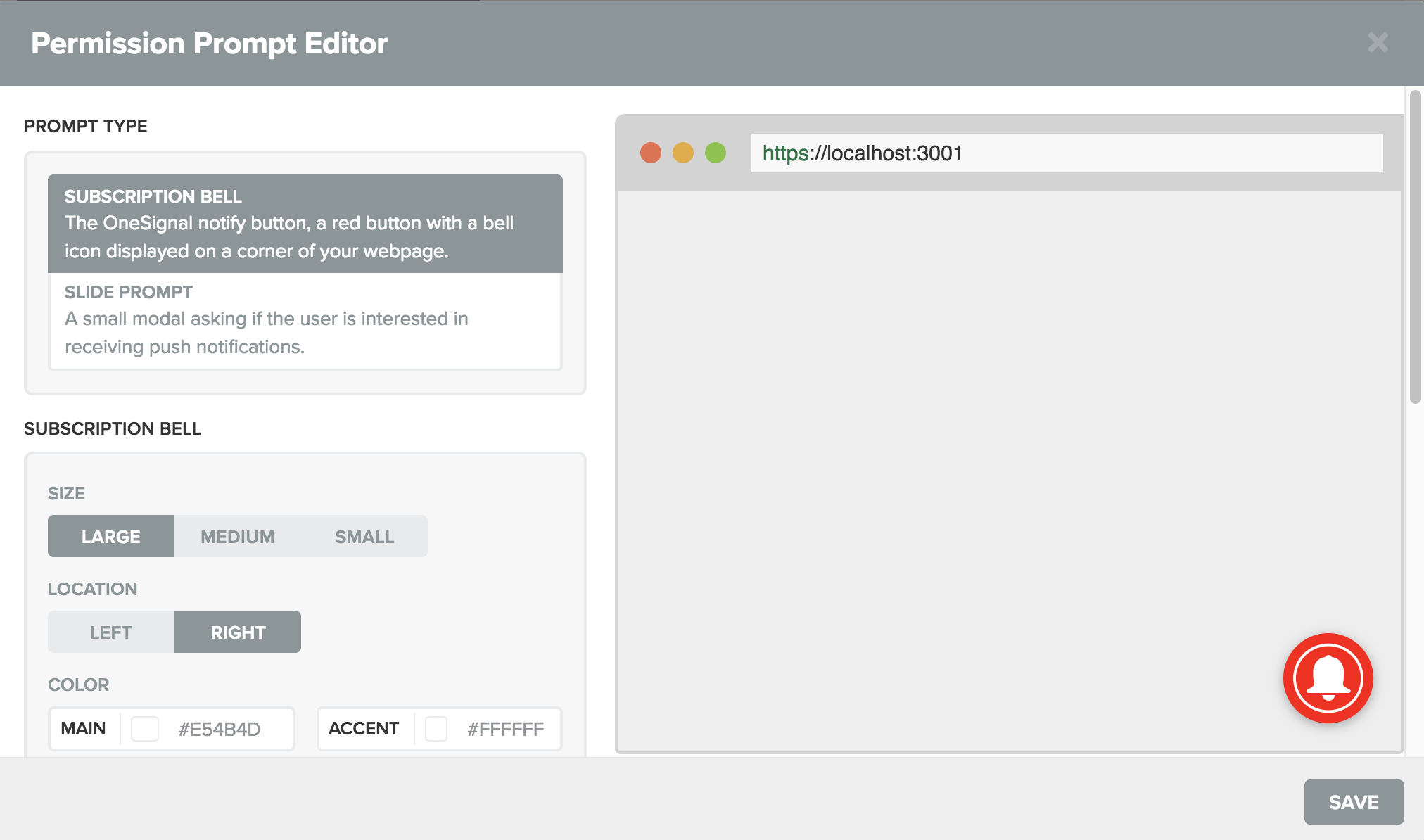
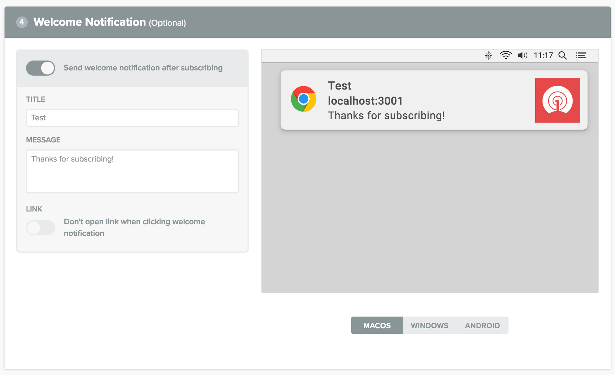
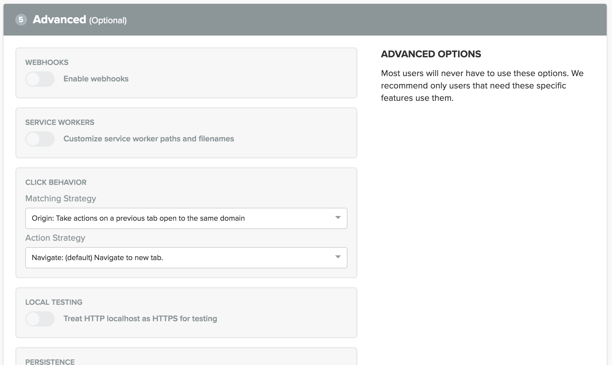
Focus on great forms - Like many enterprise products, the OneSignal dashboard is essentially one gigantic form. This meant getting forms and form elements right was a high leverage point in the design. I hand-designed each form element and spent considerable time rethinking form flows and form clustering to make the form elements as intuitive and pleasureable to use as possible.
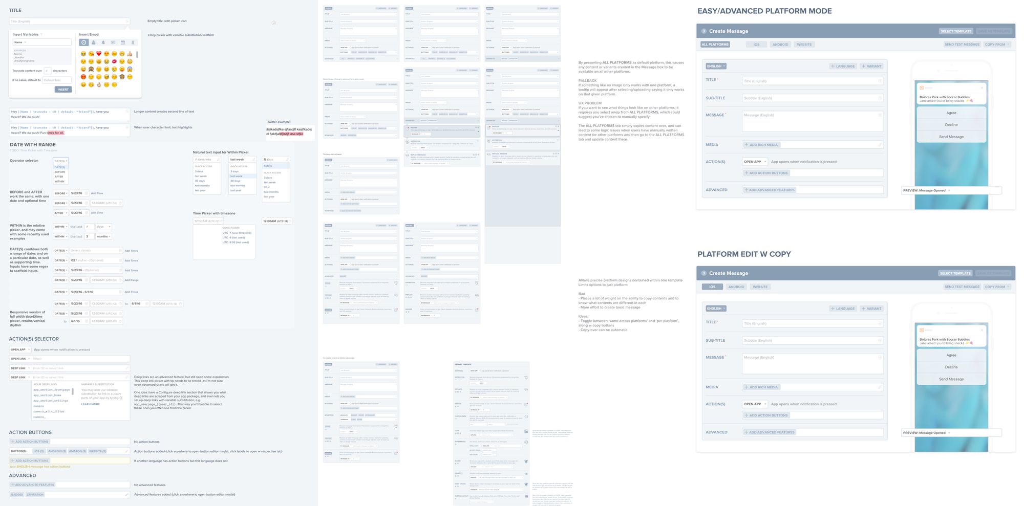
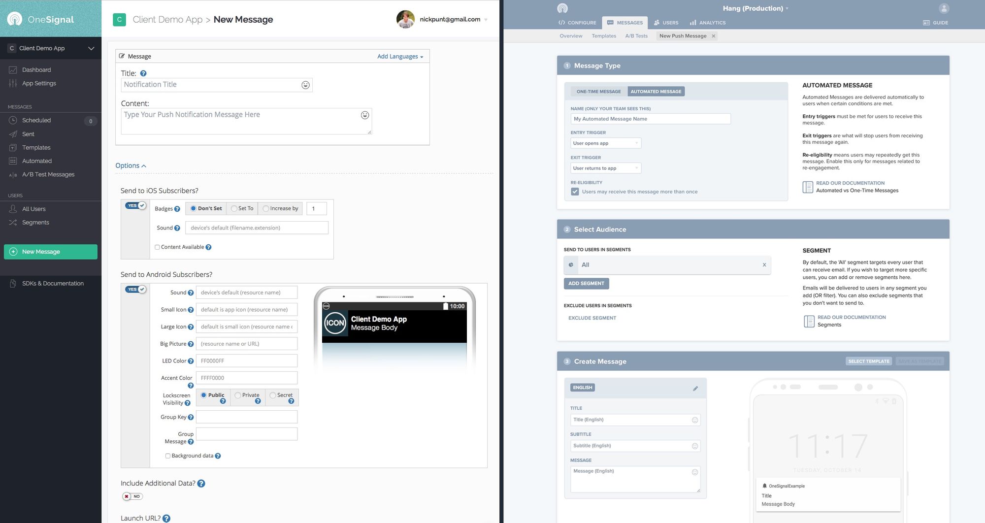
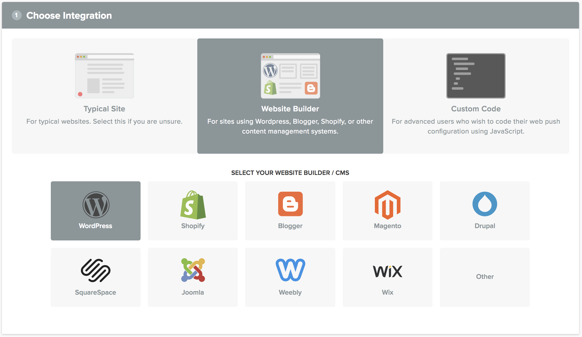
You can see some examples of these forms in the Web Push editor I launched, which provides a straightforward no-code method for configuring push notifications on websites. This was especially important for web publishers using content management systems like Wordpress, who represent a sizable portion of websites on the internet (20%+) but whose users are often unfamiliar with or intimidated by code:
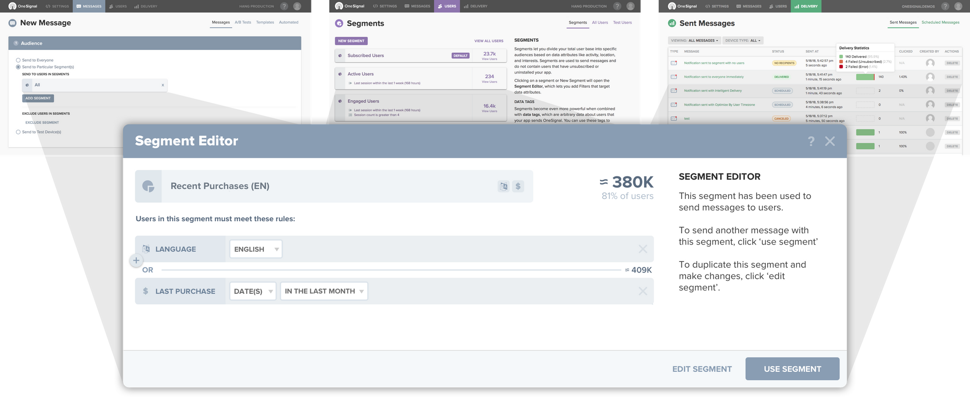
More modals - Modals greatly increased our ability to keep users on-task while allowing for quick access to certain desire paths. Our initial design typically had a page for every action, but by moving to modals we cleaned up some clutter deeper in the hierarchy, and were able to develop common interfaces for capabilities that were shared across sections. For instance, by building segment creation into a modal, users could edit audience segments without having to leave the New Message flow, whereas before they needed to do this from the Segments page.
Designing for Understanding
One of the key goals in redesigning the dashboard was to build understanding into every part of it, helping users of all types know what each feature was for and how to best use it. This involved several progressively more visible ways to orient and explain to users the purpose and functionality of the feature, from how individual form elements were labeled, to embedded contextual tips that explained features, to rewriting documentation to be a seamless extension of the product.
The inspiration for this design came from my background in education technology, especially in empathizing with the huge diversity of understanding of our customers, who often neither spoke English as a native language nor had a deep understanding of marketing as most were developers. Additionally, as a free tool we could not rely on enterprise account managers to help customers; instead the product needed to be self-explanatory. This redesign was one way we were able to scale to over a half million customers with a support staff of 1-2.
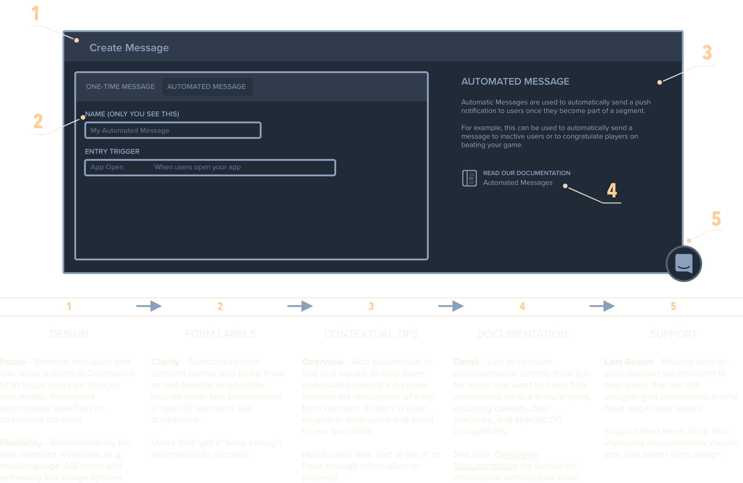
Here is how tips look in action, whenever a field is highlighted or moused over:
Iterative Development Process
At OneSignal we favored fast and incremental changes, often pushing code several times a day. The scope of the dashboard redesign was both unwinding a Bootstrap-based template in favor of custom HTML/CSS, as well as a desire to move from static HTML to React components. Keeping a redesign on a separate branch over the course of months was therefore rather error-prone, so we made changes incrementally over many months, launching the first set of visual changes as part of another feature change, and then worked behind the scenes over the next several months to implement more and more of the features in React.
In addition to identifying needs and redesigning how the dashboard would look and function, I also wrote all CSS and HTML for the OneSignal dashboard working alongside two front-end developers who implemented everything in React.
Besides that I did the more traditional PM work of speccing, scoping, and sequencing issues into releases on Github, along with the higher level executive work of market and comeptitive analysis, roadmap and strategic planning, and resource allocation.
Marketing
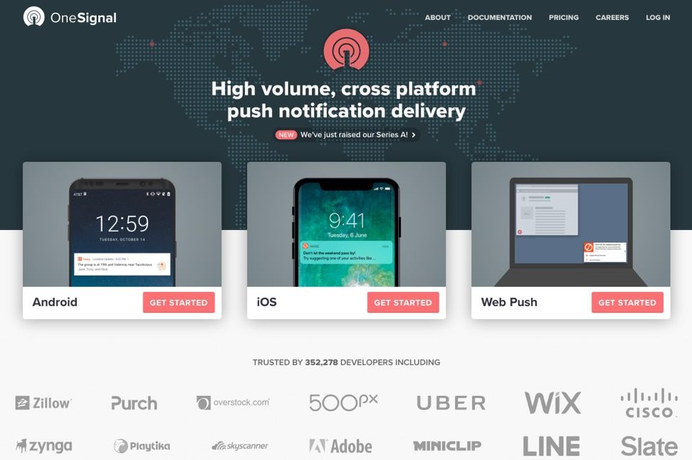
OneSignal was initially a developer-only tool, but by 2017 was quickly becoming a tool for teams that included marketers and higher value clients. This necessitated a redesign that I did of all of OneSignal's marketing presence after our Series A to add the polish necessary to move upmarket as well as improve user conversion and grow the team:
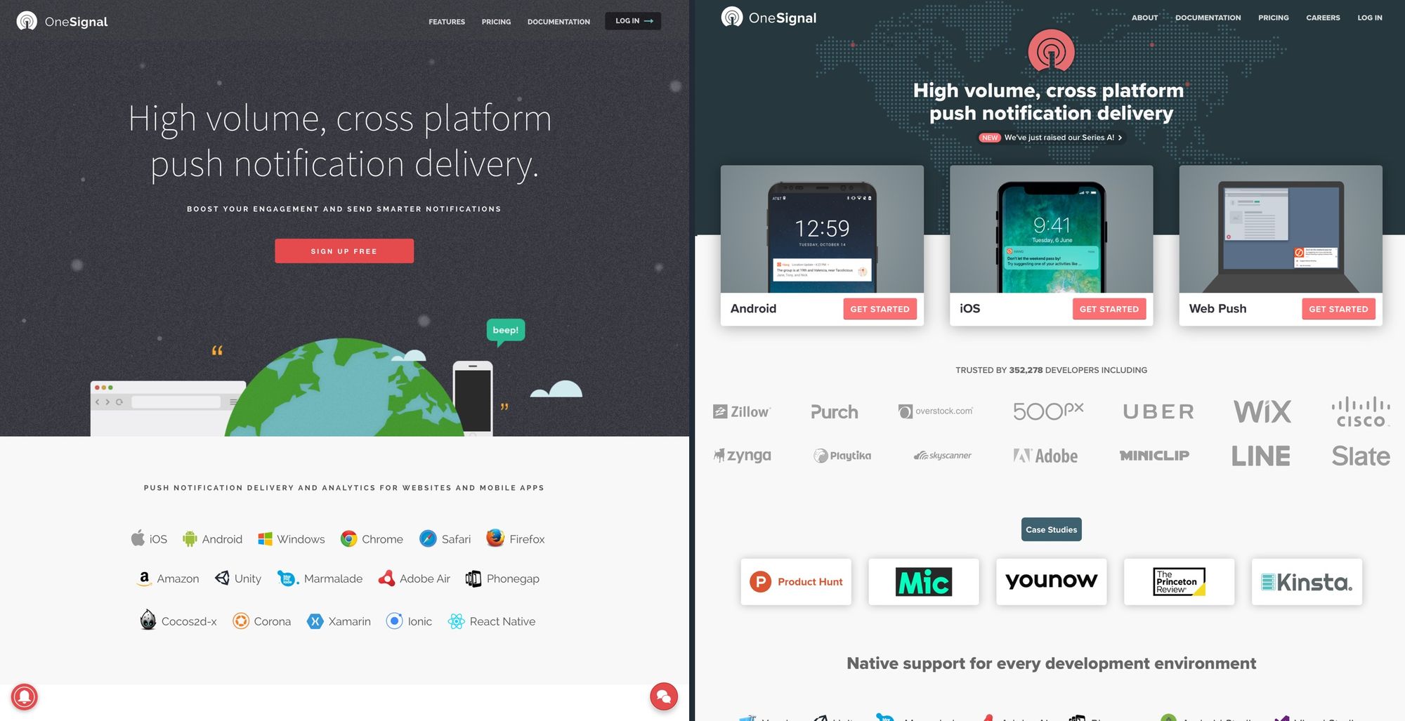
Other parts of the new (2017+) design:
Part of the strategy of the homepage was also to bring value forward in signup. As the only free push notification service, I wanted us to play to that advantage and make signup as easy as possible, rather than our competitors 'call us' approach. My hope was to push back account creation to after the point where users had done initial configuration of their app or website, thereby increasing conversion because value was seen. Unfortunately we didn't get around to building this as we already had more than enough growth.
Compare on archive.org: Before (2016) and After (2018)
Documentation
OneSignal's documentation was something all the engineers on the team contributed to, and was a critical part of our ability to be a free, self-service tool while offering free unlimited customer support. The team had created a fantastic first take on a customer-centric developer experience, however there were still many issues that needed addressing as we scaled:
- Only showed setup steps and didn’t scale well as content grew
- Didn’t explain how to use OneSignal or push notifications
- Didn’t sell the OneSignal services
- High cognitive load for users balancing code, documentation, and dashboard
- Instructions assumed a high level of technical ability, often skipping details and sub-steps that tripped up novices
In my time at OneSignal I did a nearly complete rewrite and redesign of documentation, making the following improvements:
- Redesigned information architecture to support future content & features
- Added a comprehensive product manual for the Dashboard
- Added a concepts & best practices section to explain notifications
- Fleshed out instructions with clearer explanations, steps, and more examples to help devs with less technical ability
- Created clearer relationships & links between Dashboard <-> Documentation
- Changed sections to offer easier reference points from customer support flow
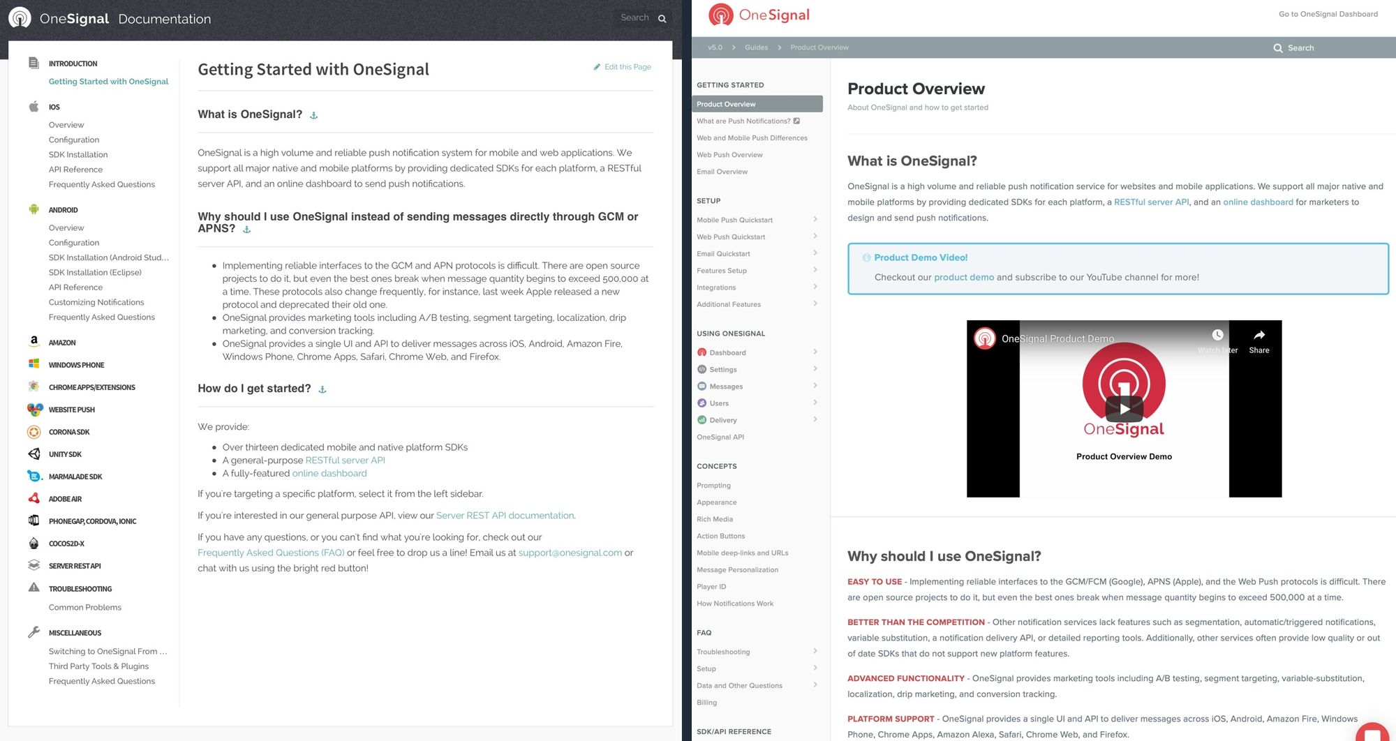
OneSignal's documentation has been the primary means for over 1.2mm developers and marketers to setup and use OneSignal, and as of 2021 continues to use the core content and structure I established in 2017-18. During my time there, support burden did not significantly increase despite customers growing by ~8x.
Compare on archive.org: Before (2016) and After (2018)
Other Work
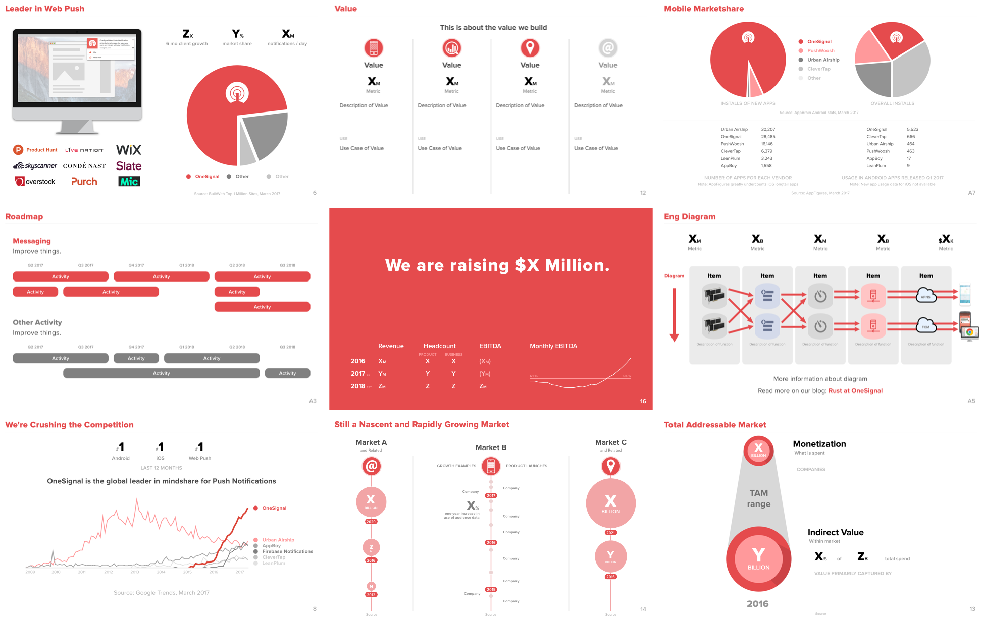
I did a lot of other work at OneSignal besides the above, including all manner of early stage executive work like helping raise the Series A, customer support, user research, building financial models, market and competitive analysis, etc that are not part of this portfolio. However I can share one example of my work on our Series A deck, which I did all the design and much of the structure of:
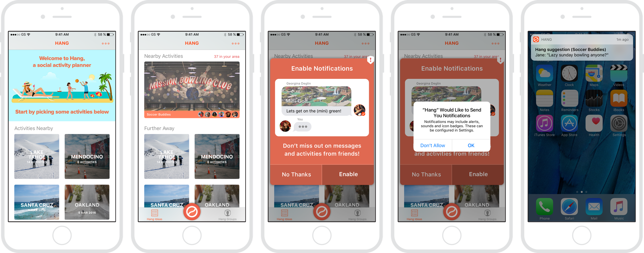
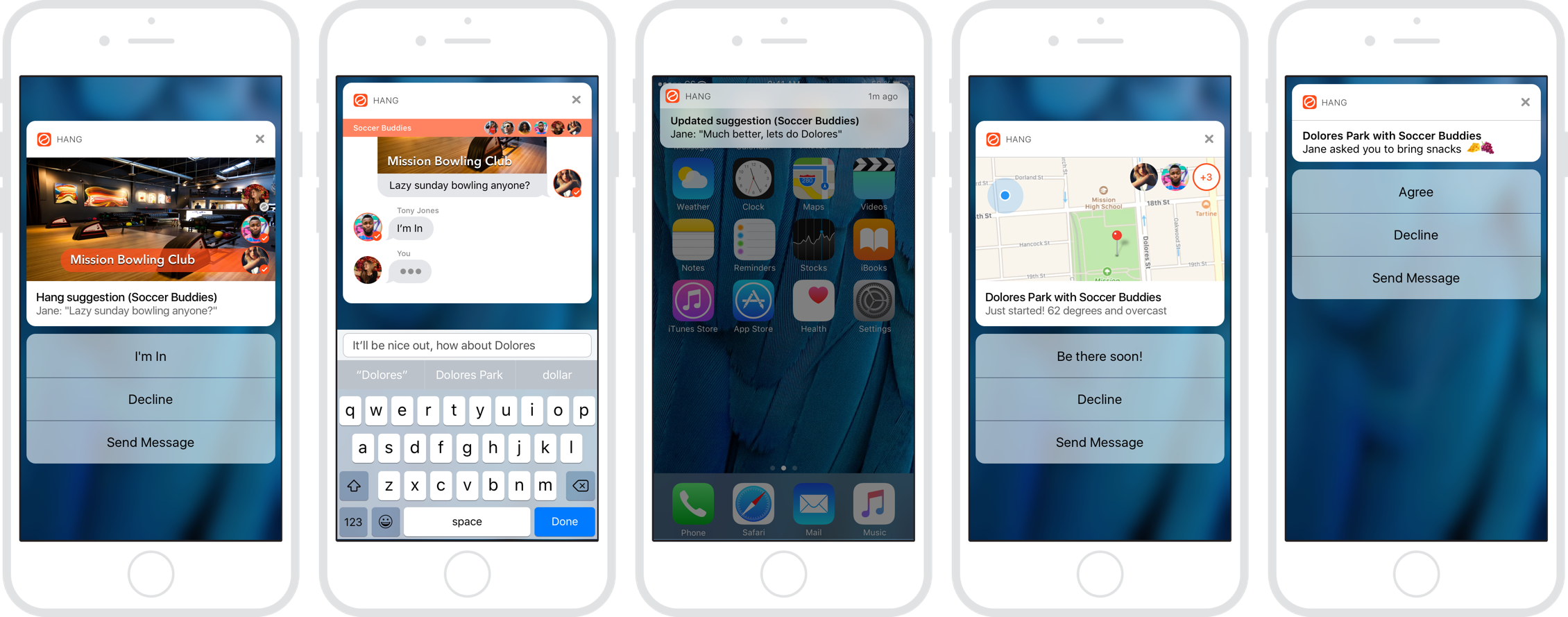
I also designed a mobile app called Hang for use in our documentation, which was an example of the power of rich notifications. Hang is about helping friends find activities to do together.
Further Reading
When to Add Hierarchy - Diving into details of my refactor of OneSignal's dashboard design
OneSignal has a Fresh New UI - Shows the dashboard redesign
Enabling Web Push Setup with OneSignal - Shows the new web push feature