There comes a time when products must add a level of hierarchy to their information architecture so they may be better set up for the future. In this post I'll go through an example of how I refactored OneSignal's information architecture and added a level of hierarchy, and discuss a few considerations to help you determine whether adding hierarchy is necessary in your product.
OneSignal's Dashboard Redesign
OneSignal is the leading push notification service on the market, with ~1mm users across ~500k apps and about 3.7% of internet sites. During my time there I ran product and design, and one of the main challenges I faced was how to help the product mature from its early developer-oriented roots into a full-featured marketing suite.
By late 2016 we were relatively early in the product-market fit growth curve, having hit ~75k users and ~400mm daily notifications and growing, fast. Our early users were almost exclusively developers, and our interfaces included our dashboard, API, and SDKs. Almost all of the features we added were in response to customer requests, and were aided by our culture of continuous improvement and deployment. If we didn't have something, we could build it quick.
Our core message delivery features were pretty well baked and included support for a lot of really esoteric functionality for different device OS', but most other advanced features that customers had been requesting like A/B testing, automated messages, and audience segmentation were very much MVPs. We knew it was only a matter of time before we got around to improving those.
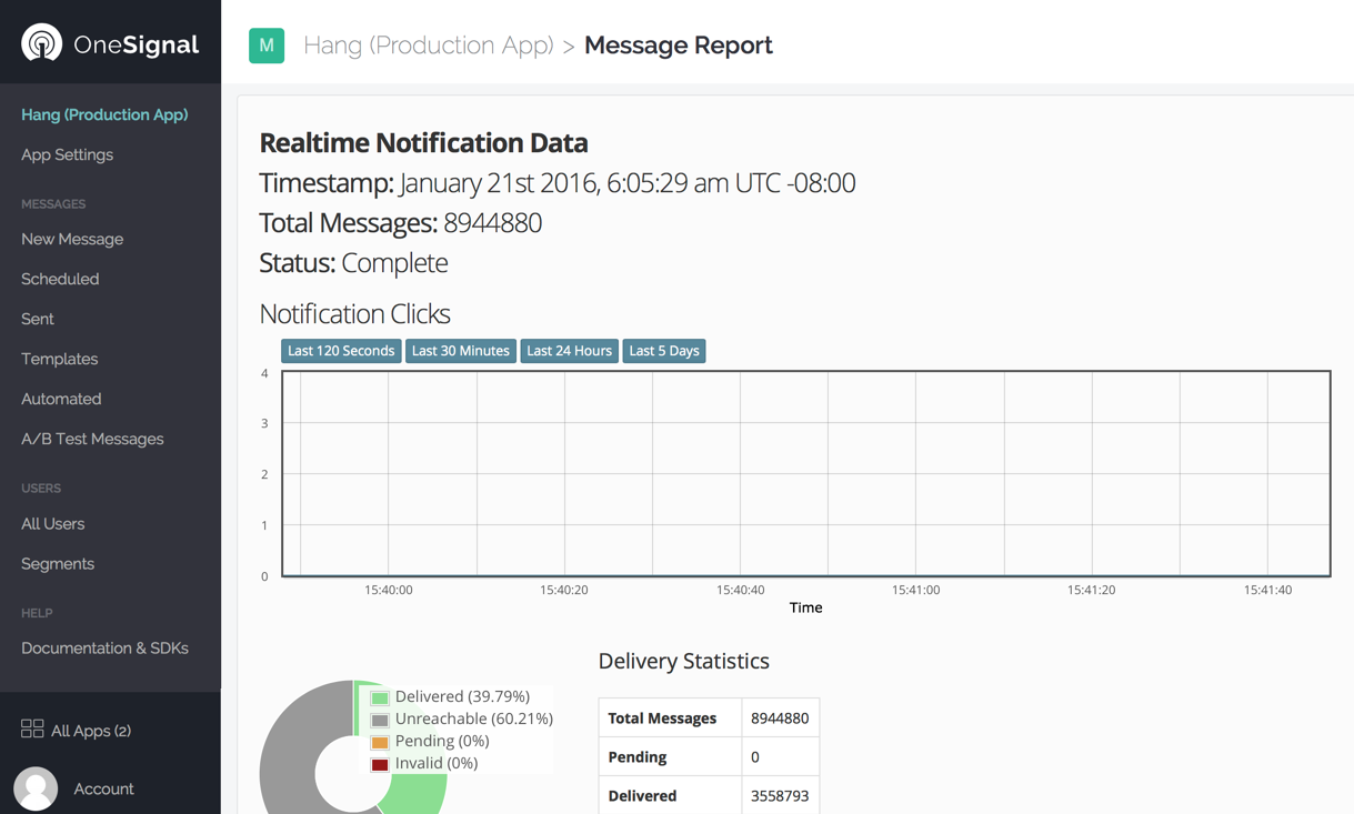
One of the effects of this highly responsive approach to customer development was the rapidly increasing complexity of all our interfaces, but especially the dashboard. The single level of hierarchy on the left menu, once a refreshingly simple display of core features, was starting to get pretty heavy:

Or in a more simple form:
$Appname
  App Settings
  New_Message
  Scheduled
  Sent
  Templates
  Automated
  A/B Test Messages
  All Users
  Segments
  Documentation & SDKs
All Apps
Account
It was clear to me that the flat hierarchy in this UI wasn't going to scale much beyond where it was. Two reasons stood out above all others:
First was the set of upcoming features we were planning. Our ambitions were starting to move beyond just being a free, high volume notification platform, moving upmarket to bigger enterprise deals with more sophisticated needs. This meant more features with more depth and complexity, and it was clear unless we did something about it, our product would wind up being incredibly daunting to use for first-time users (see: most enterprise apps). We didn't want to bombard new users with tons of links and esoteric domain-specific concepts if all they wanted to do was send a message and see how it performed.
Second was we were increasingly dealing with different types of users. We initially served developers of smaller apps who were also tackling marketing and re-engagement - often poorly, because it wasn't their background. But as we were becoming a mainstream product, and especially as we began targeting larger enterprises, the users started to bifurcate. We were talking more and more to growth marketers and designers who had nothing to do with implementation. This audience spoke a different language, cared about different things, and had a different level of technical expertise.
As a result, our challenge consisted of several parts:
- Allow room for future product growth
- Make sure it works well for both developer and marketer audiences
- Make it super easy to approach for first time and infrequent users
Process
Timing-wise, we were still small enough that it was better to make information architecture changes right away, rather than wait a year or so when our audience would have been 3-5x larger, more varied in function and skill, and less forgiving of change. Change is scary for users, and had we been in a mature market, or had a more polished product, or were growing more slowly, I probably would have only introduced these changes alongside a major feature launch to soften the blow (one part giveth, one part taketh away). But in our case, the market was far from saturated, and creating something great for users-to-come outweighed any downsides of introducing change.
The process of redesigning the information architecture involved several steps:
- doing an inventory of all features current and planned,
- breaking each feature into different UI elements required,
- figuring out key flows and what users needed next at every step,
- clustering features into meaningful conceptual categories,
- smoothing out complexity so no one section contained too many features,
- identifying the exceptions where features spanned multiple conceptual categories, and finding ways to make that work
Given the variety of ways to solve some of the problems, this was a complex process. I wound up building out a Trello board to evaluate the complexity of current and future features, dragging them around until we had the right bits in the right place, and identifying ways that could reduce complexity in the future. This wound up being super helpful as a tool to reason about complexity, so I plan to write more about it in another post sometime.
Result
Having gone through the above process, I came out with a new two-level hierarchy. In it, the top-level was about conceptual spaces that represented different needs and even departments (sending a message, seeing users, seeing message results, configuration). Meanwhile, the super-user capabilities that were more complicated and less used (a/b tests, automated messaging, test devices, filtering, email, etc) wound up as second level. Structurally, the new app changed to:
$Appname
  Configure
    App Settings (default)
    (various other configuration pages)
  Messages
    Overview (default)
      New_Message (options for Automated)
    Templates
    A/B Tests
  Users
    All Users (default)
    Segments
    Test Devices
  Analytics
    Sent Messages (default)
    Scheduled Messages
Account
All Apps
This hierarchy gave us room for future features like different message types (email and in-app), as well as a ton of specifics one level down that I won't get into here. In the UI you can see the hierarchy represented in four main tabs and the sub-tabs beneath:

The top level tabs (Configure, Messages, Users, Analytics) were laid out according to initial setup flow & usage, and which audience they were for:
- Configure - Before messages could be sent, developers needed to set up OneSignal. Users here were technical.
- Messages - The most important and trafficked part of the dashboard, this was the default tab users would arrive on when opening the dashboard, once developers had set up OneSignal.
- Users - As an app or website gained a following, users could begin explore more of their audience in this tab.
- Analytics - Once an app or website was sending significant amount of messages, metrics were important to gauge and refine performance.
Whenever a user clicked a top level tab, the first sub-tab opened by default. This tab was the most common action people wanted to take, while other, less-used features were in other sub-tabs. Second level sub-tabs had a similar left to right layout based on frequency of use and sophistication, with the leftmost sub-tab being default and the tab users used most. This also gave us room to add in temporary tabs to represent your active work, like New Push Message and Segment: Last Active 1d above.
Minding the Exceptions
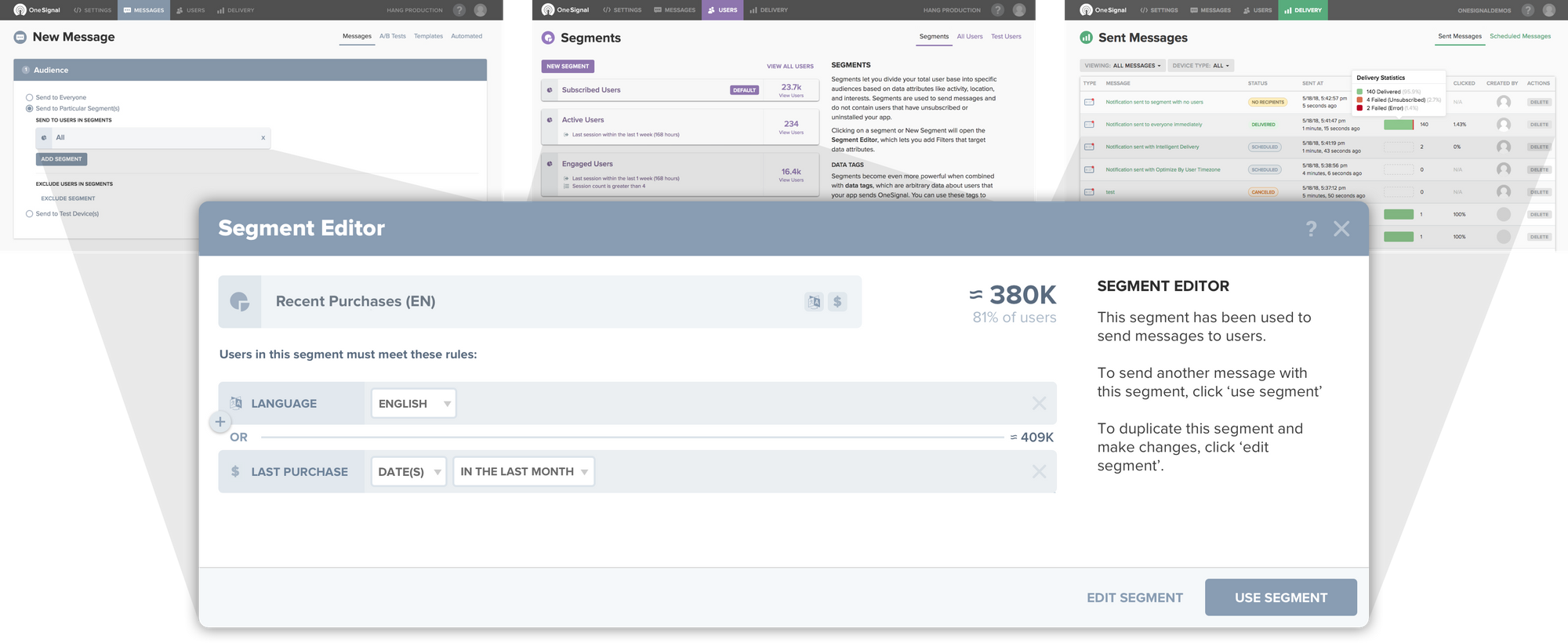
No matter how good you are at organizing things into distinct conceptual categories, complex products are going to have some features that span multiple categories. For example, users were just as likely to want to bring up Segments when creating a new message (within Messages) as they were when they were looking through their audience (within Users), and they may also have wanted to see read-only details of a segment after sending messages (within Analytics).
The solution for these was to use modals for these types of cross-category features, which allowed them to be instantiated from multiple places while not disrupting the hierarchy. While I think modals should generally be used sparingly, there are places where they are the best solution. In OneSignal's case, it worked incredibly well as a way to reduce structural complexity and provide users a few tools they needed in the context they needed them.

Takeaways
There's much more to the story of redesigning the OneSignal Dashboard that I hope to share in the future, but I think the most important and foundational part was getting the architecture right, because it set the stage for all the other capabilities we wanted to build.
Though OneSignal's information architecture was the most nuanced I've had to deal with, this was far from the only time I've grappled with whether and how to add hierarchies to a product's information architecture. It's a natural thing to grapple with as products mature, and especially early on as you're still figuring out what product you're delivering and to whom.
It should go without saying that hierarchy in information architecture is a double-edged sword. We've all used products or websites with unnecessarily complex navigation whose features are buried among boilerplate hierarchies of information. But used right, hierarchy can be a great way to hide detail that most users don't care about and keep users focused on core workflows. To generalize from these experiences, here are three situations when you may want to consider adding hierarchies:
1. When your product adds more features
The most obvious example. As products mature, they begin to explore parts of the possibility space that are only useful for a subset of users. These explorations, manifest in product features and content, increase the surface area of the product's UI and core navigation. At some point, a product consists of enough of these additions that the experience for new and infrequent users diminishes, meaning the top of the funnel is likely to suffer.
There are ways to reduce the impact of this (such as not exposing certain parts of the product until users begin using it), but at some point refactoring the information architecture to add hierarchy is worth considering.
2. When your audience expands
With traction in the market comes the expansion of target audience. Two ways this can happen:
Within vertical - this is when your new users start looking less like early adopters and more like general market users. General market users have higher expectations, so before you add hierarchy you should focus effort on polishing things up, including standardizing language, focusing on primary features, etc.
Across vertical - this is when your product has served one audience and starts to serve a second audience. New audiences bring entirely new and different expectations, which may directly conflict with your first audience. This is a case where hierarchy becomes important, a way to distinguish certain users needs from others, so everyone has a place to go where they can get their part of the work done.
3. When you support different platforms
It's hard to maintain a product's information architecture when switching platforms, such as from mobile to desktop or visa versa. The conventions and constraints of different platforms naturally suggest divergent ways to put everything together.
Some products try to deliver unified designs across all platforms, but for more complex and featureful products this can lead to a design that doesn't work particularly well anywhere. The key question to ask here is are usage patterns similar or not on different platforms. If they're dissimilar (e.g. mobile is about messaging and checking in while desktop is about content creation), it may be worth the cognitive overhead to introduce different information architectures and hierarchies.
Wrapping up
Hope you found this useful. Have stories of your own, or seen good articles? Feel free to reach out and I'll add them here.
Header image from Space Facts