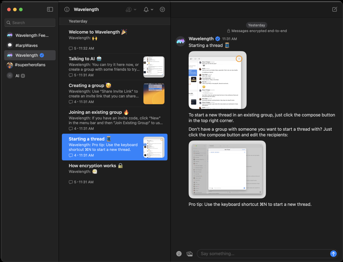
Wavelength is a new group messaging app that is exploring a middle ground between personal messaging apps like iMessage and WhatsApp and sprawling and overwhelming large community streams like Discord and Slack. It's aimed at groups of people that want more of the intimacy and ease of use of the former, without the chaos of the latter. Basically it's purpose is to lower the entropy in small group communication. John Gruber has a good overview of the app.
The main UI design difference is the introduction of an additional layer of hierarchy of separate threads for different conversations. The UX follows the typical Apple app convention of a sidebar, a set of items, and the item itself, seen in everything from Apple's Mail app to the journaling app Day One to the writing app Ulysses. In Wavelength's case, the design contains different groups, then threads within that group, then the conversation itself.

The result is a straightforward, no-frills app that's exploring an interesting social design space. It also raises some questions about what kind of behavior the medium wants from its users.
Dynamic, yet Organized
With the introduction of threads in a separate hierarchy, one of Wavelength's key design questions is: How do you make this space feel dynamic, yet organized?
Threads are meant to organize conversations and control the chaos of messaging. But by adding an additional step for users to navigate, they also present a fundamental user experience trade-off: ease of writing vs. on-topicness.
This trade-off has existed since the very beginnings of internet forums. The easier it is to write something, the more chaotic the conversations are. The more communities emphasize well-organized conversation spaces, the more the user has to think about which forum or thread to write their message.

For instance, lets say you are part of a local parent group of maybe 10-15 families (about 25 people), and you want to share a particular recipe that you found. The group has been communicating quite a bit over the last several months, so there's an ever-growing list of threads. Lets say 20.
In this circumstance, if you're diligent, you might look through all of them to figure out which one might work. But at some point, with a long list of threads, you may just say 'screw it' and post in whatever thread is most convenient, or create a new one in the stack that everyone else will have to pass by when looking for the thread they're interested in.
In doing so, entropy increases ever so slightly, and the culture of your group starts to shift to 'post whatever, wherever'. If this happens enough, the entire point of a product like Wavelength begins to unravel.
The above example is something that became apparent pretty quickly in my own use, where a lack of meaning of each thread has made it confusing for even a small group of 4 people with only 4 open threads to know exactly where to post.
The Purpose and Lifecycle of a Thread
What I find missing in Wavelength today, and what I think is absolutely necessary for a threaded messaging app to work, is a sense that threads have real purpose, and that threads have a lifecycle including being sunsetted.
A thread's purpose is why users will go to it to talk versus another thread, and how on-topic that conversation will be. With a lot of purpose, threads will be both memorable and relatively on-topic. With little purpose, users will indiscriminately use threads, like in the above example.
A thread's lifecycle is how different coversations begin, carry on, and conclude over time. For instance, some topics may be ephemeral (e.g. planning a trip), while others are ongoing (e.g. recipe sharing).
Both purpose and lifecycle work hand-in-hand and may be emphasized by adding affordances and friction into the design.
Changes I'd Make
Right now Wavelength doesn't quite have the features built out yet to get the most out of the messages-and-topics model, and to really suggest to people how to use threads (findability, on-topicness, norms of creating new ones). I know it's very early in the product, but here are some ideas I think would help a lot:
Better Thread Management
The first change I'd make is to provide more affordances to define the purpose of threads.
- Ability to name/rename threads, since the first message is often not the most explanatory.
- Ability to pin threads, so users can track the ones they care about.
- Ability to manually delete, archive, or merge threads, though this may introduce some social complexities.
- Ability to customize threads, so the thread is more memorable. Customizations could include emoji, backgrounds, and custom plugins, stickers, or other assets. This creates much more of a sense you're entering a room rather than one chat that's difficult to differentiate from the next. It also makes it more fun and increases the likelihood people find it worth the hassle of switching from iMessage and other more ubiquitous offerings.
Emphasizing purpose means users will care more about the distinctions between threads rather than create unnecessary new threads or drop conversations wherever is convenient, and will make individual threads more memorable to users, reducing the organizing burden.
Automatically Sunset Threads
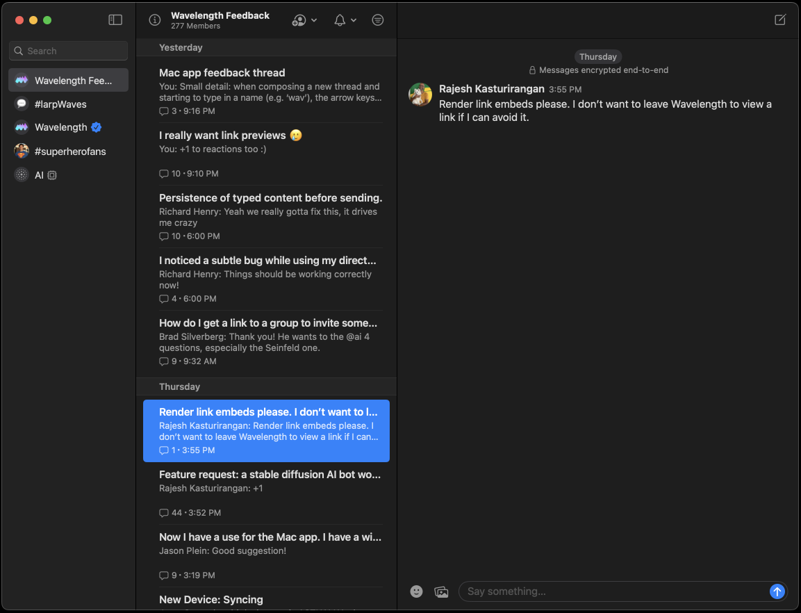
Currently, all threads look identical, with only a difference of order (new ones atop, old ones down the list). In other words, they're all 'active'. This suggests the user should scan each one before writing a message.
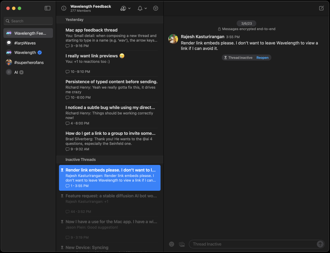
Therefore the second change I would make is to sunset inactive threads, to reduce the user's obligation and burden of scanning old threads before writing a message, and to create a sense of dynamism to the conversation space. This change involves creating a distinction between 'active' and 'inactive' threads visible in the UI. How to do this:
- Threads become inactive after ~2-4 weeks of inactivity.
- 'This thread is now inactive' appears in the ledger of the inactive thread.
- Add a table header in the thread list for 'Inactive threads', possibly even hide them behind a show/hide toggle.
- Gray out inactive threads in the thread list for visual distinction.
- If users want to post in an old thread, require users reactivate a thread with a dialog ('open this thread again? Y/N')


Inactive threads before & after
I believe this design finds a middle ground of dynamic yet organized, by favoring on-topicness within the active time window and otherwise favoring ease of writing. The lack of visibility of old threads suggests users need not scan the inactive threads to find a thread with the topic they want to talk about (e.g. the recipe they found). Meanwhile the speedbump of navigating to grayed out inactive threads and taking the explicit step of reopening one is enough to suggest to users they should probably just post a new thread.
Conclusion
The promise of adding an additional layer of hierarchy in threads is that group conversations have more signal and less noise. Wavelength is just starting its exploration of the frontier of the dynamism of messaging and the organization of larger forums, and I think with more emphasis on purpose and lifecycle of threads will really help the product out.
Wavelength is still a very young product with I'm sure a big roadmap full of ideas and I look forward to seeing what they build next!