Summarizing a tweetstorm from 10/8/2019
MacOS System Preferences is one of Apple's best and least appreciated designs. Prefs are a difficult design challenge, because doing them well means making a lot of hard choices about what you let users configure, and what you don't.
OS Preferences encompass all the ways users are going to use the OS. They're a collection of meaningful use/edge cases that make sense to support, each of which may expose many possible options, and each of which is likely to have 10-100k users who absolutely rely on it.
Designing system preferences is an exploration on the frontier of simplicity and flexibility. Too simple and it's rigid and leaves people behind, too configurable and the user is overwhelmed. It requires really deeply understanding users & use cases to find the right balance.
Much like how you should judge a society based on how it treats it's least well off, I think you can judge an OS by how it treats it's least desirable user experience: that of messing with the bowels of the OS to get it to do the thing you want it to do.
MacOS System Preferences, born in the golden age of OSX (10.4+) prior to iPhone, have all sorts of touches that go above and beyond to make this experience really compelling. In no particular order, here's a few:
In search, there's a custom UI that not only highlights options in the UI as you type in keywords that match, when you press enter it also blinks the option selected and bring you to it. This teaches you how to get back.
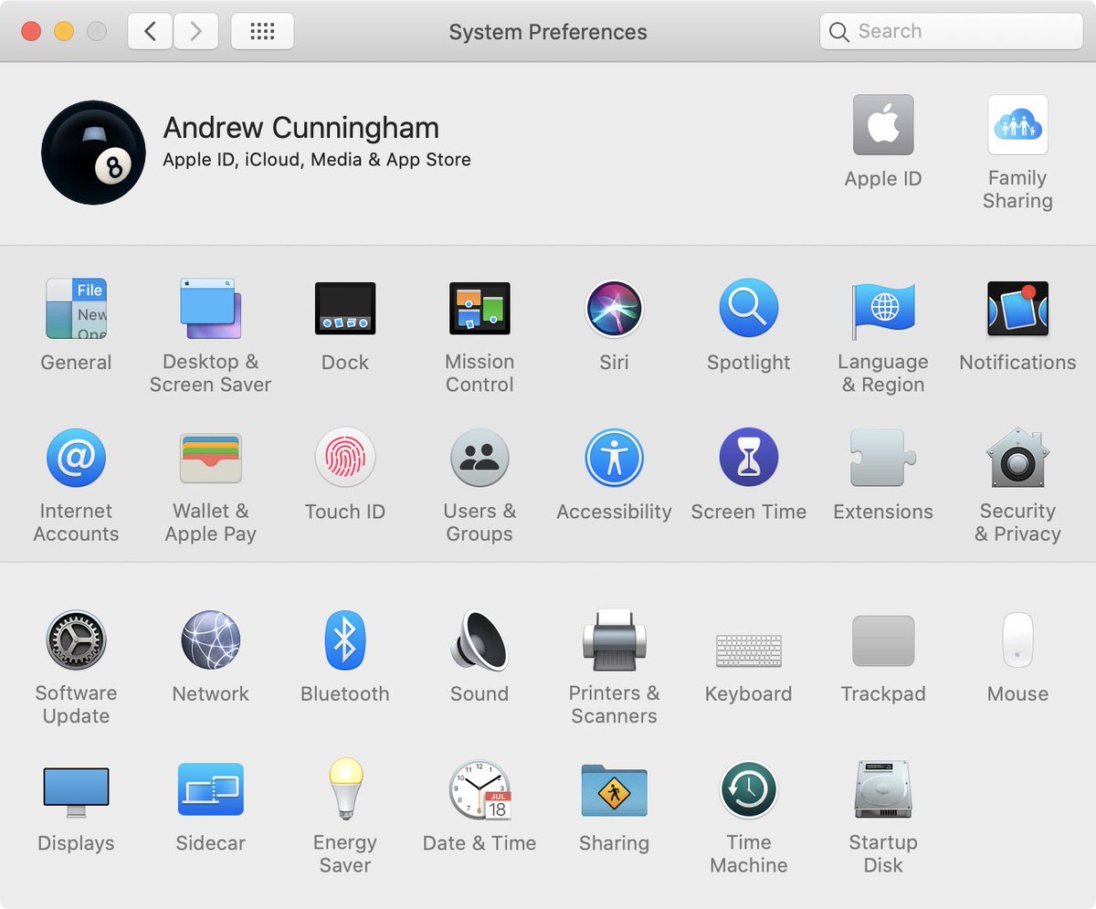
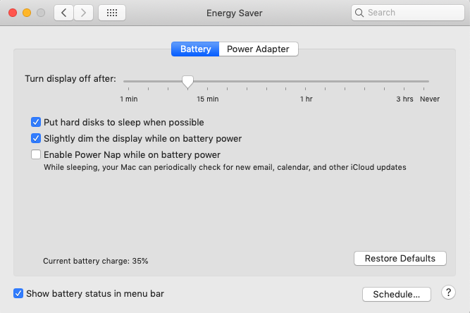
In each preference pane, there are only a few options presented at any one time, making it easier to digest. The options are also in a hierarchy with the most important ones as larger, sometimes custom, widgets. This energy saver pane is super economical with options & text.
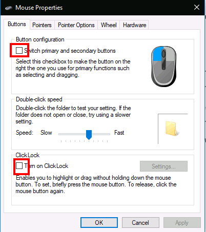
You can also rely on preference panes to provide great, specific visuals that leave little room for misinterpretation. This trackpad pane is way beyond just setting an option, it's teaching you how to use the very system you're on.
Finally, how the preferences are visually grouped together is just wonderful. Each line of 8 icons is a set of preferences that conceptually relate. This makes skimming super easy, since your eyes are drawn to skim across each line rather than see a jumble of icons.
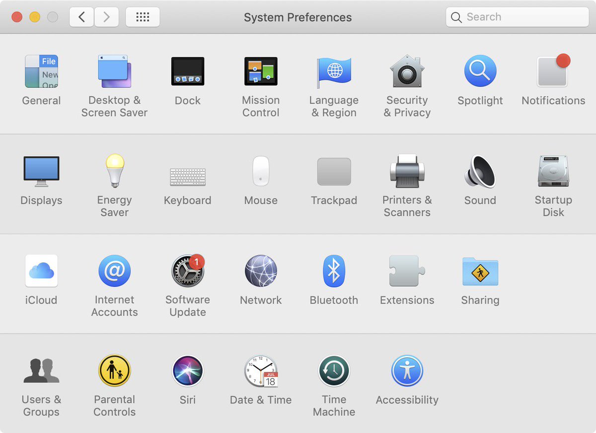
Fast forward to today, and MacOS Catalina has just updated System Preferences. It's new visual grouping to slowly bring it in line with iOS. Now there's two bundles of 16 preferences, each spanning two lines, but unfortunately with a bit less conceptual relationship.

I'm honestly a bit disappointed in the change since the visual grouping I feel really worked well. But as often is the case, optimizing happens at different levels - MacOS is part of a broader Apple ecosystem, where iOS dominates and MacOS must stay consistent.
Regardless, I think the best way to appreciate System Preferences is to compare it to Settings / Control Panel on Windows which has never struck the right balance of simplicity, specificity, graphics, and grouping in information architecture and seems to change with each version.
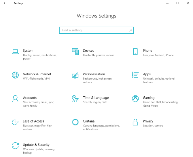
In Settings, rather than do one thing, each top level option contains within multiple options, effectively setting up a 3-level hierarchy. This has the knock-on effect of forcing the user to parse a lot of text, and makes the icons (distant) secondary rather than primary cues.
Additionally, as consistent as the basic UI elements are, they're also exceptionally bland and provide few visual cues or opportunities for direct manipulation that might help users figure out what they're doing. You may as well be filing your taxes in this UI.
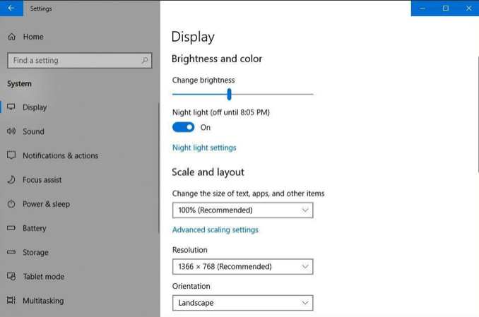
Finally, Windows 10's settings are only skin deep, as many older options lay beneath in an entirely different UI. Ironically, this older UI isn't nearly as antiseptic as the new design.
In Windows, you can tell there just isn't the same attention to detail. Settings are an afterthought, they're the crappy plywood on the back of the chest of drawers. Meanwhile, System Preferences shows Steve Jobs' ethos of crafting the whole thing to a high standard front to back.